You did an experiment or a survey, or you collected data, and you are ready to analyse them. But what is the first step? Everyone will tell you that you have to visualise your data with graphs. Yes, but how? and why? What are the common pitfalls to avoid?
We are very grateful to Marion Louveaux, bio-image data analyst for this combination, adaptation and translation of the two French articles “Les pièges de la représentation de données” and “Comment se passer d’un barbarplot ?”.
Let’s imagine that your dataset contains the sizes of two groups of individuals, A and B. You want to know if the size of the individuals differ between the two groups. In this article, we will show you first an example of a bad approach for data visualisation, and then give you advice on how to proceed in the right way.
The script used to generate this dataset is available at the end of this article.
What not to do: the barbarplot driven analysis
Table of Contents
The bar-bar-plot
To compare two populations, you probably learned to look at the mean and standard deviation. Your first idea is to do a barplot to represent the mean, with an error bar for the standard deviation. This kind of graph is commonly called a “barbarplot”. To compute a summary variable (here, the mean and the standard deviation) separately for different groups, we use group_by + summarise.
library(tidyverse)
info <- data %>%
  group_by(Group) %>%
  summarise(Mean = mean(Size),
            SD = sd(Size))
ggplot(info, aes(x = Group, y = Mean, fill = Group)) +
  geom_bar(stat = "identity", position = position_dodge(),
           colour = "grey30") +
  geom_errorbar(
    aes(ymin = Mean - SD, ymax = Mean + SD),
    width = .2, position = position_dodge(.9), size = 1
  ) +
  scale_fill_viridis_d()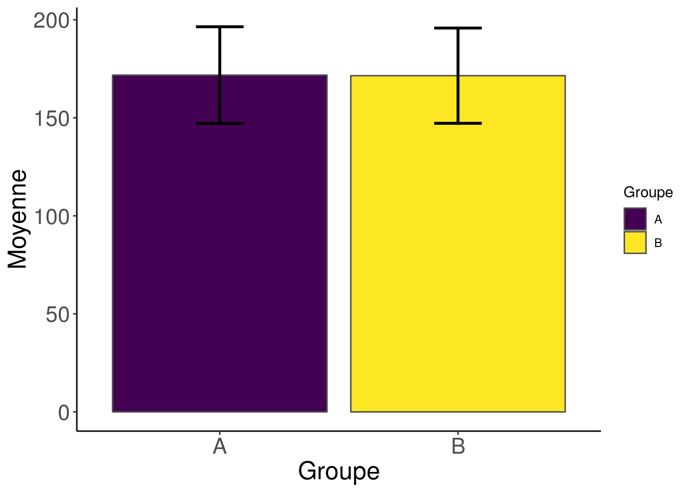
Well, it seems that there is no variation at all here!
The boxplot
Just to be sure, you decide then to have a look at the data distribution. You probably learned that a boxplot (geom_boxplot) is usually used to visualise a distribution. Then let’s go!
ggplot(data, aes(x = Group, y = Size, fill = Group)) +
  geom_boxplot(colour = "grey30") +
  scale_fill_viridis_d() +
  scale_y_continuous(limits = c(0, NA),
                     expand = c(0, 0)) +
  guides(fill = FALSE)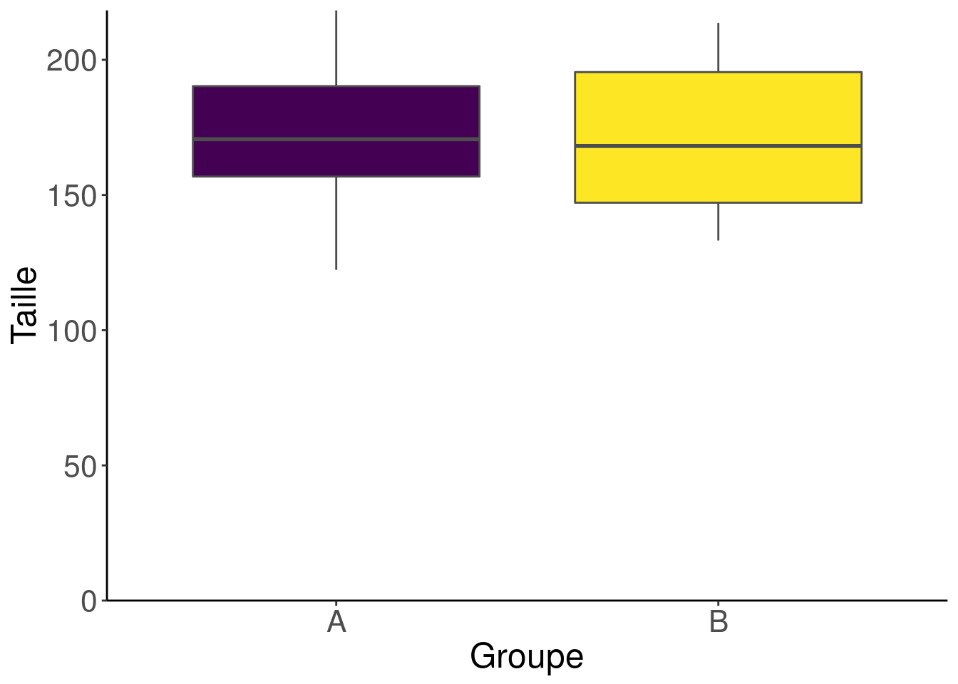
Well, regarding the distributions of sizes, the two populations still seem fairly similar.
The raw data histogram
You are very tempted to stop here, but you suddenly remember that distributions can be also visualised with an histogram, even if you find it less easy to read. So let’s do an histogram (geom_histogram) with the raw data.
ggplot(data) +
  geom_histogram(aes(Size, fill = Group),
                 position = "identity",
                 alpha = 0.60,
                 bins = 10) +
  scale_fill_viridis_d() +
    scale_y_continuous(limits = c(0, NA),
                     expand = c(0, 0))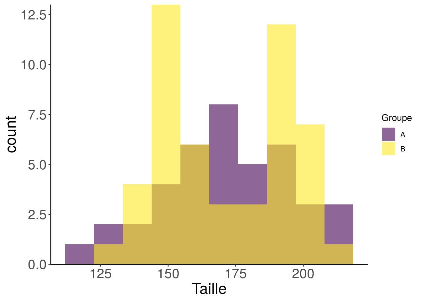
Oooooops! What the hell is this mess?! The distribution in group B has two peaks!??
Common pitfalls of graphical representation
Visualising data before analysing them is important. It helps to identify trends and potential effects. It also helps looking for extreme values or outliers and deciding to remove them or keep them depending on your question. And it helps choosing the most appropriate statistical tests. Indeed, depending on the type of data (binary, linear, quadratic, bimodal, …), you will not do the same analyses. At that point, you are probably wondering why we are making a new article today, whereas there is already plenty of blog articles about data visualisation, starting with our own ggplot2: welcome viridis. Well, this comes from a simple observation: yes, visualising data with beautiful graphs is a good start, but it is better to choose relevant data visualisation… 😓
Bad choices of graphical representations can lead to graphs that are hard to read, but most importantly they can bias the interpretation. One can see a difference where there is none, or, on the contrary, not see a difference when this one is very important! Or one can have the impression that there are links between the measured variables, when there are not, or the contrary. You don’t want to misunderstand your data, but you also wouldn’t want to present misleading graphs to your readers and take the risk that one may think you are trying to lie about your data, would you?
Regarding misleading graphs, here are a few critics about the barbarplot shown above:
- the group legend should be removed, as done for the boxplot. There is no point in having the same information in two different places.
- the X axis needs to be moved to the zero level of the Y axis because the size of individuals can only be positive. We would not want to lie about the scale of differences…
- the so-called error bar is by no means a visual means of representing the result of a possible statistical test of mean comparison: (i) the statistical difference between the means of two groups cannot be detected by comparing the standard deviations of the distributions. (ii) the statistical difference can be represented through the confidence interval of the mean estimate, not through the error bar.
- if you ever calculate the standard deviation of the distribution of the mean estimate, you should display a bar about twice the standard deviation on each side of the mean for a representation of the 95% confidence interval.
By the way, displaying a “p-value” has never been a guarantee of your sincerity and does not give more confidence in misrepresentation.
Remember that a graphical visualisation is a simplification of the raw data. You may lose information. It is therefore important to choose an appropriate graphical visualisation. Moreover, graphical representations such as barplots only use summarized statistics of your data, namely the mean/median and standard deviation. The boxplot show additional statistics, but to know the distribution of the data, so nothing is better than an histogram or a violin plot to look at the raw data.
What to do: the raw data driven analysis
Raw data exploration: choosing the appropriate graph
The first and most important (and usually forgotten) step is to take a look at the distribution of the raw data, with one variable at a time.
Use a barplot (geom_bar) for data counts in categories
The surface under each bar represent a quantity: the barplot is like a picture from the side of big potato bags into which you put all the objects you wanted to count. If you would not be able to do it for real, the barplot is not the right graphical representation. Here, we can use a barplot to compare the number of individuals in each group, because it would be possible to put all individuals for real in two potato bags.
ggplot(data) +
geom_bar(aes(Group, fill = Group), colour = "grey30") +
scale_fill_viridis_d() +
scale_y_continuous(limits = c(0, NA),
expand = c(0, 0)) +
guides(fill = FALSE)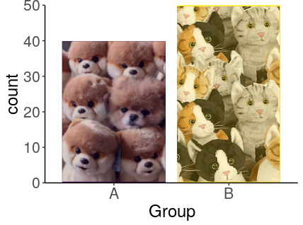 With this graph, we see that we don’t have the same number of individuals in group A and B.
And yes, we cheated a bit here to put all the individuals in the “bags”, but this is just to give you an example…
Use an histogram (geom_histogram) to represent numerical data
While one cannot put all size values from all individuals in potato bags, one can put all individuals of the same size in the same bag, hence the bars of the histogram.
ggplot(data) +
  geom_histogram(aes(Size), bins = 30)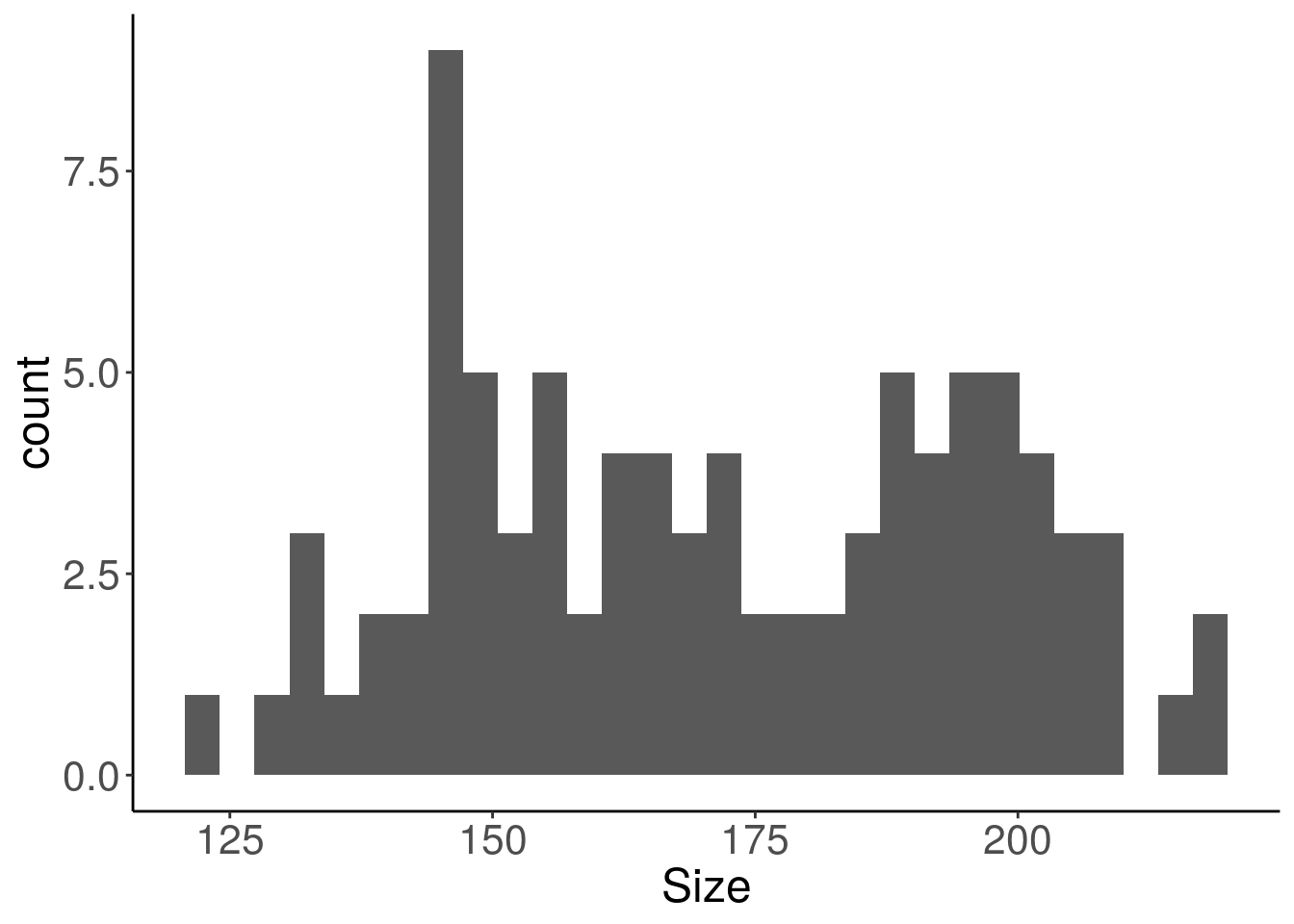
Here the distribution of the sizes do not correspond to a simple known distribution, but there seems to be at least two groups.
Data exploration using multiple variables
Once one know the distribution of each of the variable of the dataset, one can have a look at their behaviour in combination with another variable. This is where we can separate the histogram according to the groups.
For a final graph, the histogram is not the prettiest representation. For a start, we could smooth it a bit with geom_density. Note that the degree of smoothing can be chosen, like the number of classes of a histogram.
ggplot(data) +
  geom_density(aes(Size, fill = Group),
                 position = "identity",
                 alpha = 0.60) +
  scale_fill_viridis_d() +
    scale_y_continuous(limits = c(0, NA),
                     expand = c(0, 0))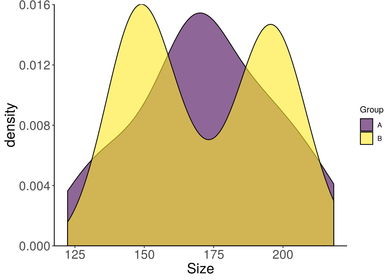
The violin plot
The violin plot offers a pretty alternative to the histogram. We can display the previous distribution densities vertically for a better visualisation. And we will add the median as a bonus.
ggplot(data) +
  geom_violin(aes(Group, Size, fill = Group),
                 position = "identity",
              draw_quantiles = c(0.5),
              colour = "grey30") +
  scale_fill_viridis_d() +
    scale_y_continuous(limits = c(0, NA),
                     expand = c(0, 0)) +
   guides(fill = FALSE)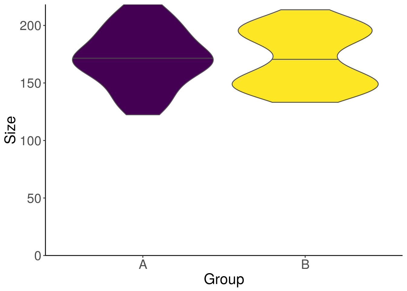
One can no longer hide the bimodal aspect of group B. However, in this figure, we can’t see how many individuals are in each group. We wouldn’t want to lie to our readers…? We will now overlay the individuals on the violin plot using geom_dotplot.
Note that if you have few individuals in each group, the violin plot does not always look very good. In this case, you can choose to use only the geom_dotplot with a binwidth adapted to your data.
library(cowplot)
# sample size
sample_size <- data %>% count(Group)
data_size <- data %>%
  left_join(sample_size, by = "Group") %>%
  mutate(myaxis = paste0(Group, "\n", "n=", n))
# violin with median
g1 <- ggplot(data_size) +
  aes(myaxis, Size, fill = Group) +
  geom_violin(position = "identity",
              draw_quantiles = c(0.5),
              colour = "grey10", alpha = 0.7,
              scale = "count") +
    geom_dotplot(method = "histodot", binaxis = "y",
                 dotsize = 0.8, binwidth = 10,
                 stackdir = "center"
                 ) +
  scale_fill_viridis_d() +
    scale_y_continuous(limits = c(0, NA),
                       expand = c(0, 0)) +
  xlab(NULL) +
  guides(fill = FALSE)
# dotplot with mean
g2 <- ggplot(data_size) +
  aes(myaxis, Size, fill = Group) +
    geom_dotplot(method = "histodot", binaxis = "y",
                 dotsize = 1, binwidth = 10,
                 stackdir = "center"
                 ) +
  stat_summary(fun.y = "mean", fun.ymin = "mean", fun.ymax = "mean", size = 0.5,
               geom = "crossbar", colour = "grey30") +
  scale_fill_viridis_d() +
    scale_y_continuous(limits = c(0, NA),
                       expand = c(0, 0)) +
  xlab(NULL) +
  guides(fill = FALSE)
cowplot::plot_grid(plotlist = list(g1, g2))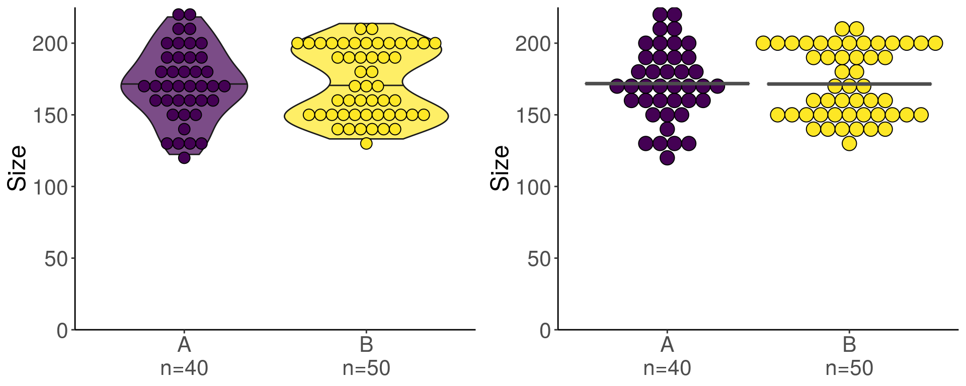
With this kind of data, we know now that we cannot go any further in the statistical analysis without violating the construction assumptions of some tests…
In conclusion
- always look first at the distribution of the raw data
- check the variables one by one, then have a look at the relationships between variables
- never do a statistical test before the exploration steps mentioned above
- for low number of individuals, overlay the points on the graph (for instance use
geom_dotplotin combination withgeom_violin) - choosing the wrong graphical representation can make people think you are trying to lie about the data. Have a look at the website data-to-viz.com to choose an appropriate graphical representation that will not leave any doubt about your intellectual honesty.
Do not hesitate to leave your comments and questions at the bottom of the article. We’ll read them carefully.
Appendix
- To create the same fake dataset:
set.seed(4321)
data <- tibble(
  Size = c(rnorm(40, 170, 30), rnorm(25, 145, 10), rnorm(25, 195, 10)),
  Group = c(rep("A", 40), rep("B", 50))
)- For the graphs in this article, we defined a default ggplot2 theme using
theme_set(theme_classic()).
Translated and adapted by Marion Louveaux, bio-image data analyst

