A blogpost inspired by a tweet and a YouTube video.
‘Luminance-gradient-dependent lightness illusion’
Table of Contents
In the last days, I’ve stumbled upon this tweet:
A demo of lightness perception pic.twitter.com/BSVpgcuIw1
— Akiyoshi Kitaoka (@AkiyoshiKitaoka) August 12, 2018
Which is a demonstration of how our perception of color is affected by the lightness surrounding this color.
Also recently, I’ve been watching the useR 2018 YouTube recordings, which contains a video called The Grammar of Animation, presenting {gganimate} a package by Thomas Lin Pedersen extending the {ggplot2} grammar of graphics to include animation.
If you want to know more about {gganimate}, feel free to browse the GitHub repo, and watch the YouTube video.
Back to our lightness perception: as you can see, the illusion is made by hand, with a piece of paper, moving the square manually. Let’s recreate this with gganimate.
The R Code
Creating the data.frame
So, we’ll need three things:
- A variable stating all the transition states
- A variable for
ymin and max, which will stay the same - A variable for
xmin and max, which will be incremented by one on each transition states.
d <- data.frame(
  # x coordinates
  x1 = 1:10, x2 = 2:11,
  # y
  y1 = 4, y2 = 5,
  # transition time
  t = 1:10
  )
Getting the background
The background is basically a gradient from #000000 to #FFFFFF (read this post for more about hex color notation). Let’s create that object:
library(grid)
g <- rasterGrob(
  # Creating the color gradient
  t(colorRampPalette(c("#000000", "#FFFFFF"))(1000)),
  # Scaling it to fit the graph
  width= unit(1,"npc"), height = unit(1,"npc")
  )
Creating the ggplot
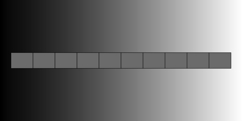
I’ll first create the ggplot object, which is composed of 10 squares, filled with the same grey: "#7E7E7E". I use the theme_nothing() from {ggmap} as an empty theme.
library(ggplot2)
gg <- ggplot() +
  annotation_custom(g , -Inf, Inf, -Inf, Inf) +
  geom_rect(data=d,
            mapping=
              aes(xmin=x1,
                  xmax=x2,
                  ymin=y1,
                  ymax=y2),
            color="black", fill = "#7E7E7E") +
  ylim(c(1,8)) +
  ggmap::theme_nothing()

gg
Animation is illusion
Let’s now animate our plot to create the illusion. As I want the move to be linear, I’ll use a combination of transition_time and ease_aes('linear') to make the transition smooth.
library(gganimate)
gg_animated <- gg +
  transition_time(t) +
  ease_aes('linear')
And tadaa !
gg_animated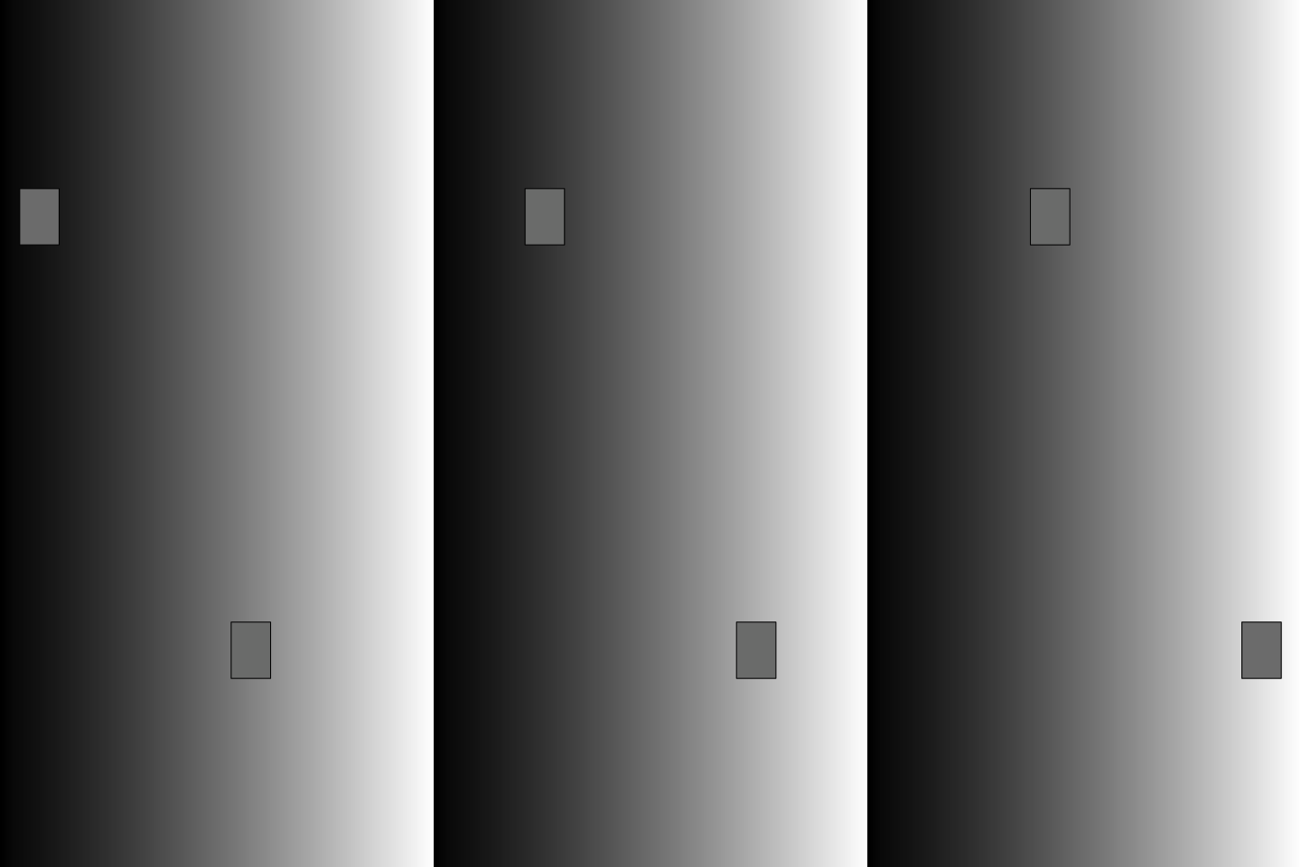
On this animation, the square appears to be changing color. But it’s not: the fill is always "#7E7E7E".
What’s behind
Luminance and perception of color
“Every light is a shade, compared to the higher lights, till you come to the sun; and every shade is a light, compared to the deeper shades, till you come to the night.” —John Ruskin, 1879.
OK, let’s forget R to focus on what is happening here, and quickly talk about perception of luminance (the level of light coming to your eye) and color.
We are here facing a phenomenon known as a “gradient illusion”. The important idea behind this is that every color we perceive is influenced by its surrounding: in other words, we perceive the color lighter on the left of our image, as it is contrasted with black. The more the square move toward the white, the more the grey appears dark.
How does it work? When a color comes to your eye, you perceive a certain amount of luminance. In other words, you are able to tell if something is dark or light or somewhere in the middle. Our ability to do so is called “lightness consistency”, but these gradient illusions show us one thing: this ability is not perfect, and the “luminance environment” in which the color appears influence how we see it.
A phenomenon to know
So, as we’ve just seen, perception of color is influenced by its surrounding. When it comes to creating a dataviz, color scales are crucial – even more now that we know that. Let’s imagine that for some weird reason we have created this plot:
ggplot() +
  annotation_custom(g , -Inf, Inf, -Inf, Inf) +
  geom_col(aes(x = 1, y = 3), fill = "#7E7E7E") +
  geom_col(aes(x = 8, y = 4), fill = "#7E7E7E")
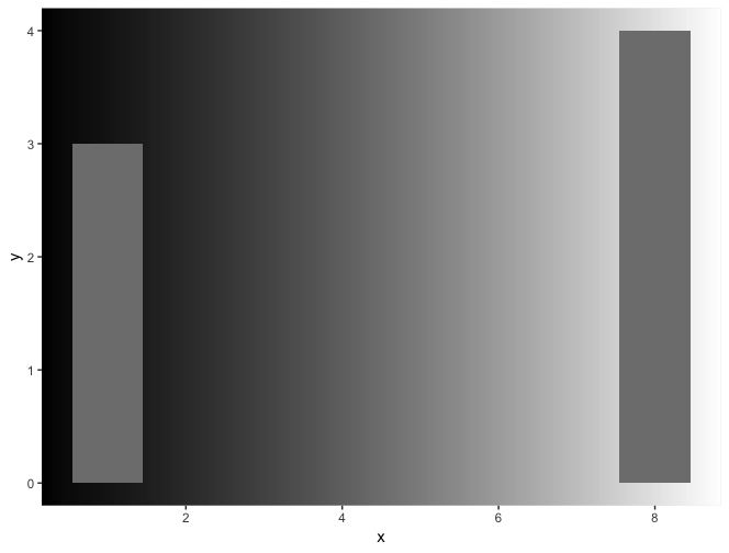
Again, the fill is the same, but one bar seems to be darker than the other, which can trick the reader into thinking the value in the two is not the same. Something to consider if there is a chance your plot will be turned to black and white.
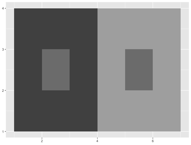
Let’s say we are drawing a map. Maps are composed of regions, and can be colored following a specific scale. But there’s a probability that two regions with the very same result on that scale would be surrounded by two opposite colors. For example, two #7E7E7E could be surrounded one by #515151, the other by #aeaeae.
ggplot() +
  geom_rect(aes(xmin = 1, xmax = 4, ymin = 1, ymax = 4), fill = "#515151") +
  geom_rect(aes(xmin = 2, xmax = 3, ymin = 2, ymax = 3), fill = "#7E7E7E") +
  geom_rect(aes(xmin = 4, xmax = 7, ymin = 1, ymax = 4), fill = "#aeaeae") +
  geom_rect(aes(xmin = 5, xmax = 6, ymin = 2, ymax = 3), fill = "#7E7E7E")
What to do now?
- Now that you know this phenomenom, pay attention to it when you create plots
- Be careful when chosing palettes
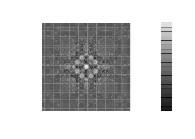
- Try to turn your graph to black and white with
colorspace::desaturate
with_palette <- function(palette) {
  x <- y <- seq(-8 * pi, 8 * pi, len = 40)
  r <- sqrt(outer(x^2, y^2, "+"))
  filled.contour(cos(r^2) * exp(-r / (2 * pi)),
    axes = FALSE,
    color.palette = palette,
    asp = 1
  )
}
with_palette(
    purrr:::compose(
      colorspace::desaturate,
      viridis::viridis
    )
)
