Let’s welcome the viridis palette into the new version of {ggplot2}!
Viri-what ?
Table of Contents
viridis is one of the favorite color palettes of one of the member of the team (guesswho).
The viridis palette was first developed for the python package matplotlib, and has been implemented in R since.
The strengths of this palette are that:
- plots are beautiful (which is good enough a reason to use it)
- colors are perfectly perceptually-uniform, even when printed in black and white (yes, people still print stuffs in 2018…)
- colors are perceived by the most common forms of color blindness (an important feature)
This palette is now the default color scheme for colormap in the matplolib python package. It had been available as a color scale in R with the {viridisLite} package, then as a ggplot2 scale in {viridis}, and is now fully integrated in {ggplot2} with the last release.
Why viridis? The story behind
As said in A Better Default Colormap for Matplotlib: “colormap are interfaces between your data and your brain” — which means that the choices of colors can have a significant effect on the way you make decision. We won’t go into the details of color theory (there is a lot of literature on that topic, and we are not the best to speak in depth about it), but it’s pretty obvious that colors influence the way you perceive things.
For example, in western Europe (and I guess in many countries around the globe), we are culturally conditionned to think of a red sign as an alert. Green on the other hand tends to indicate something sage. If today I had to design a color scheme for error / warning / success, I would undoubtly go for a red / orange / green solution. I’m not the only one, and the first example that comes to my mind is the {shinyalert} package, which has this exact model of colors. This seems simple (and it is), and there is a lot of articles and books about this paradigm applied to marketing and selling (I’ll let you Google-scholar that). For example, here is an “emotion color wheel” called the Plutchik’s wheel of emotions, made by the psychologist of the same name:
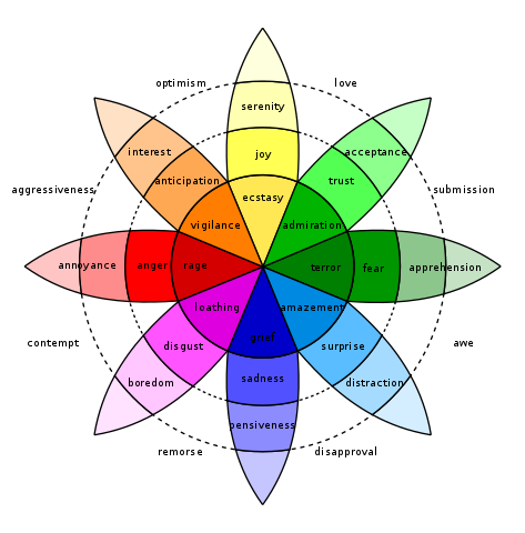
NB: we do not share / endorse this simplified theory of color, it’s just used there as an example 😉
Let’s take a more serious example, borrowed from the talk I linked just before. In an article (that sounds like a lot of fun) called “Evaluation of artery visualizations for heart disease diagnosis” (link), the authors showed how a color palette can play a critical role in diagnosing the presence of an heart disease. I’ll let you dig into the details if you want to, but long story short, the color palette of the software used to visualise the results has an effect on the capacity of the professional to read and detect a specific condition.
Why are we talking about that? Because as we want R to be used in production for visualising data, it’s important to keep in mind that the color scheme we choose in the end product to use is not without impact: being simply on readability or in the emotions that is conveyed by the graph.
Here comes a new challenger
The standard color palette in a lot of tools is called the Jet palette. You might be familiar with it, as it is implemented in a lot of softwares. This color scheme appears as a good choice to many as we tend to think that this palette makes it easy to distinguish colors (spoiler: it doesn’t).
It looks like this:
library(matlab)## Attaching package: 'matlab'## The following object is masked from 'package:stats':
## reshape## The following objects are masked from 'package:utils':
## find, fix## The following object is masked from 'package:base':
## sumThis example is taken from the viridis vignette, put into a function
with_palette <- function(palette) {
  x <- y <- seq(-8 * pi, 8 * pi, len = 40)
  r <- sqrt(outer(x^2, y^2, "+"))
  filled.contour(cos(r^2) * exp(-r / (2 * pi)),
    axes = FALSE,
    color.palette = palette,
    asp = 1
  )
}
with_palette(jet.colors)
Let’s just for a second compare to the same data with viridis:
library(viridis)## Loading required package: viridisLitewith_palette(viridis)
If it seems obvious to you that the viridis palette is easier to read… it’s because it is.
How to implement a new color palette
With the viridis colormap, the purpose was to have something that is:
- colorful
- pretty
- sequential
- perceptually uniform
- working with black and white
- accessible to colorblind
So how can one do that? How can one implement a new palette that answers these demands? Before getting into the that, let’s analyse how the data go from your computer to your brain.
To be projected, the data is transformed in RGB notation (for “Red Green Blue”), either as an hex (#FFCC99), as a percentage (rgb(100%,80%,60%) : 100% red, 80% green, 60% blue) or as a number between 0 and 255 (rgb(255,204,153)). All these notations are the same: the hexadecimal notation being used to represent numbers from 0 to 255 with 16 symbols (from 0-9 & A-F, 16^2 being 256).
In a lot of cases, with color, there are two symbols added to the end of the hex, used for indicating transparency. For example:
viridis(2)## [1] "#440154FF" "#FDE725FF"Note: this is made possible by the fact that a pixel is coded using 32 bits, and a color is represented only 24 out of these 32 bits (3*8), leaving room for another 8 bits.
Note bis: you remember that the hex notation allows 256 combinations, which correspond to the number of possible combination for 8 bits (2^8).
So once you have your lowest color, and your highest, you can use a color palette generator to get a range of color from one to the other. It’s done, for example, by the colorRampPalette function from {grDevices} :
colfunc <- colorRampPalette(c("black", "white"))
colfunc(10)

[1] "#000000" "#1C1C1C" "#383838" "#555555" "#717171" "#8D8D8D" "#AAAAAA" "#C6C6C6"

[9] "#E2E2E2" "#FFFFFF"
The computation of this range is out of the scope of this article, but you get the idea 🙂 Once we have decided what our palette should look like, it is then possible to scale your data to fit your palette: as your palette is going from one point of the color scale to another by passing by a series of intermediary tones, you can give each value of your data a spot in you colormap. The lowest value of your data is mapped to the lowest value of the palette, and the highest to the highest.
The viridis colormap
So now that we have the theory, let’s get to the big question: how can we choose a palette that is colorbling friendly? To do that, the solution found by the viridis colormap is to avoid the red and to go from blue to yellow,as these colors can be seen by most of the colorblind.
Let’s use the {dichromat} package to simulate that :
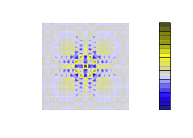
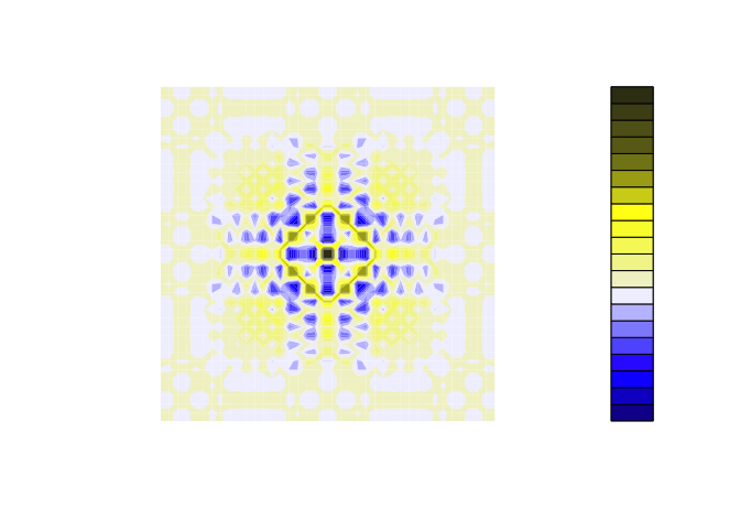
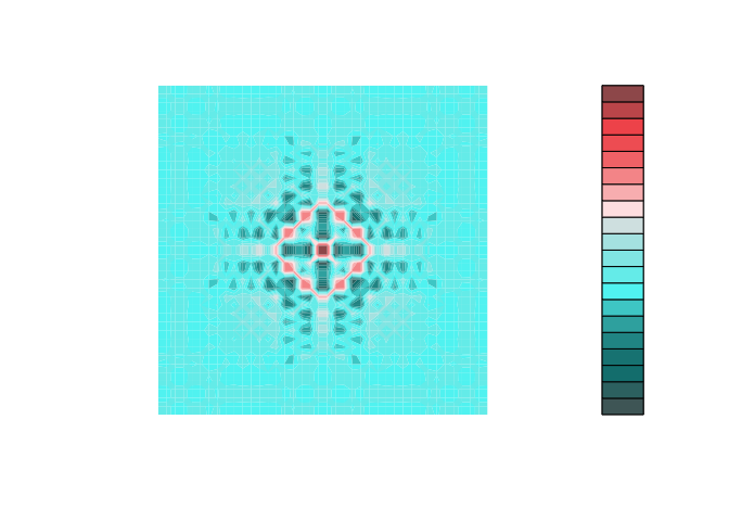
library(dichromat)Let’s see what the jet palette looks like when you simulate several cases of colorblindness:
library(purrr)
with_palette(
  compose(
    partial(dichromat, type = "deutan"),
    jet.colors
    )
)
with_palette(
  compose(
    partial(dichromat, type = "protan"),
    jet.colors
    )
)
with_palette(
  compose(
    partial(dichromat, type = "tritan"),
    jet.colors
    )
)
And with viridis:
with_palette(
  compose(
    partial(dichromat, type = "deutan"),
    viridis
    )
)
with_palette(
  compose(
    partial(dichromat, type = "protan"),
    viridis
    )
)
with_palette(
  compose(
    partial(dichromat, type = "tritan"),
    viridis
    )
)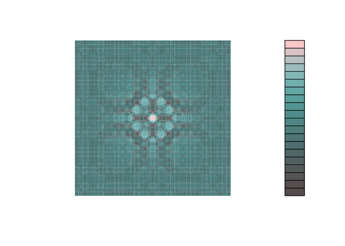
As you can see, the contrast stays readable in every situation.
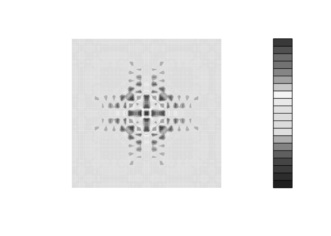
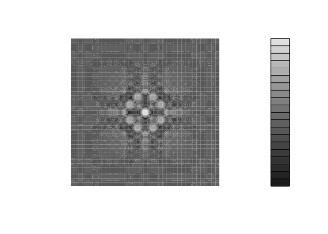
Finally, to suit the printing need, the palette had to go from dark to light. And the wider range was from dark blue to bright yellow. Let’s just compare two examples:
with_palette(
  compose(
    colorspace::desaturate,
    jet.colors
    )
)
with_palette(
  compose(
    colorspace::desaturate,
    viridis
    )
)
Back to R
So, enough theory, time to get back to R.
viridis as a 📦
Let’s imagine for a minute we are using the old version of ggplot2 (as many still do as we write this lines).
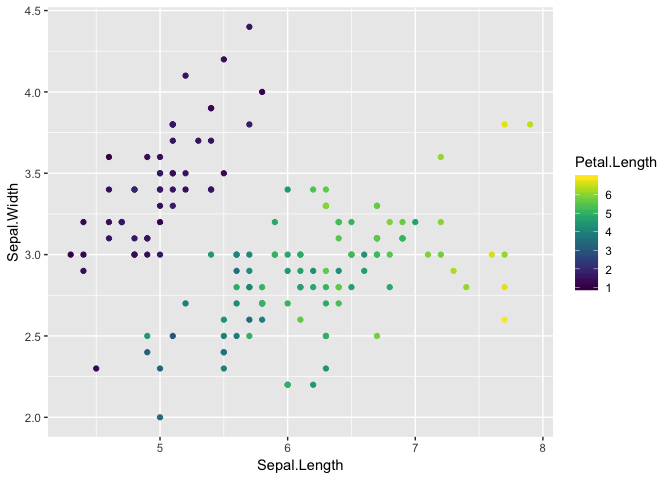
When using this (now old) version of {ggplot2}, we needed the {viridis} package to use this color palette.
library(ggplot2)
library(viridis)
ggplot(iris) +
  aes(Sepal.Length, Sepal.Width, color = Petal.Length) +
  geom_point() +
  scale_colour_viridis() # from the viridis package
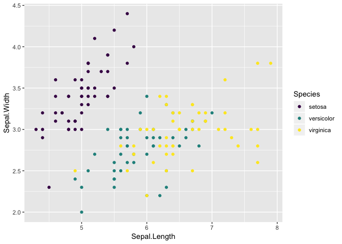
Another way to do that was to get a vector of hex colors, with the {viridisLite} package (note that the functions from {viridis} call functions from {viridisLite}).
## [1] "#440154FF" "#21908CFF" "#FDE725FF"
ggplot(iris) +
  aes(Sepal.Length, Sepal.Width, color = Species) +
  geom_point() +
  scale_color_manual(values = pal)
viridis as a ggplot scale
But now, thanks to the new ggplot2 (version 3.0.0), you can call directly the viridis palette with the ad hoc functions.
ggplot(iris) +
    aes(Sepal.Length, Sepal.Width, color = Species) +
    geom_point() +
    scale_color_viridis_d()#From ggplot2

There are two scales for numeric inputs: discrete (scale_color_viridis_d) and continous (scale_color_viridis_c).
And there is of course the counterpart with fill :
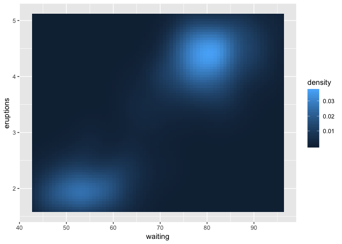
ggplot(faithfuld) +
  aes(waiting, eruptions, fill = density) +
  geom_tile() +
  scale_fill_viridis_c()

Note the difference in readability compared to the default palette:
ggplot(faithfuld) +
  aes(waiting, eruptions, fill = density) +
  geom_tile()
Also, viridis is the new default palette for ordered factors :
diamonds %>%
  dplyr::count(cut, color) %>%
  ggplot() +
  aes(cut, n, fill = color) +
  geom_col()
Finally, and I didn’t presented them so far, but there are 4 other available colormaps: “magma” (or “A”), “inferno” (or “B”), “plasma” (or “C”), and “cividis” (or “E”), which can be passed to the option argument in the various scales:
ggplot(mtcars) +
  aes(mpg, disp, color = cyl) +
  geom_point() +
  scale_color_viridis_c(option = "A")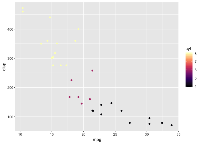
ggplot(mtcars) +
  aes(mpg, disp, color = cyl) +
  geom_point() +
  scale_color_viridis_c(option = "B")
ggplot(mtcars) +
  aes(mpg, disp, color = cyl) +
  geom_point() +
  scale_color_viridis_c(option = "C")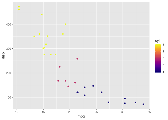
ggplot(mtcars) +
  aes(mpg, disp, color = cyl) +
  geom_point() +
  scale_color_viridis_c(option = "E")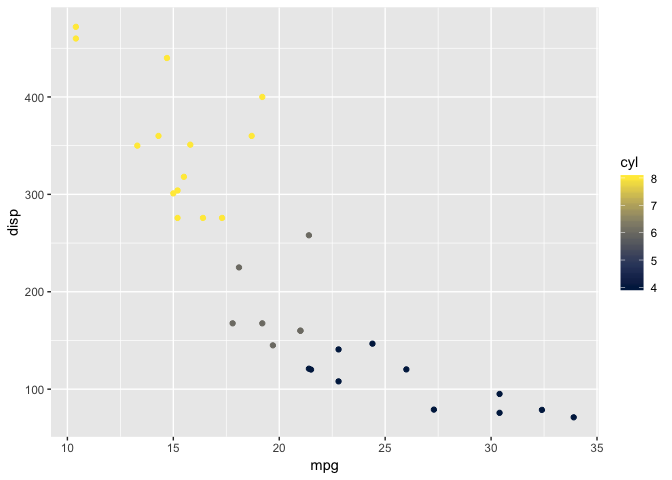
So, to sum up: 💛💚💜💙
And in conclusion, here is why the inclusion of viridis as a native scale in ggplot2 is a good news:
- More beautiful plots (but in the end, that’s secondary)
- Better and more inclusive end products : easier to read for people with colorblindness or vision problem
NB: of course, this was already possible before, but the fact that it is now native will make it more used and reknown.

